Andrej Tozon's blog

In the Attic

NAVIGATION - SEARCH

Silverlight TreeView: MVVM and editing [3 – Delete]

After the first two introductory posts, we're ready to move into the TreeView control itself. We’ll begin by implementing the easiest of the three update commands (insert/update/delete) – to delete an item in a TreeView.

This one actually looks very simple, all we need is to redefine TreeView’s ItemTemplate by adding a delete button we’ve created in the previous post:

<slt:TreeView.ItemTemplate>
    <slt:HierarchicalDataTemplate ItemsSource="{Binding SubTopics}">
        <StackPanel Orientation="Horizontal">
            <TextBlock Text="{Binding Name}" VerticalAlignment="Center" />
            <Button ToolTipService.ToolTip="Delete Topic" Margin="2,0,0,0" 
                    input:CommandService.Command="DeleteTopic" 
                    input:CommandService.CommandParameter="{Binding}">
                <Image Source="/EditableTreeView;component/Resources/delete.png" Stretch="None" />
            </Button>
        </StackPanel>
    </slt:HierarchicalDataTemplate>
</slt:TreeView.ItemTemplate>

As we’ve seen in the previous post, associating the delete Button with the DeleteTopic command will invoke the same command when the button is pressed. What’s new is that we’re now passing the current item as a CommandParameter. By ‘current item’ I don’t mean the currently selected item, but the item, which button was clicked.

In order to get this working, we have to change the ViewModel as well:

private void OnDeleteTopicExecuted(object sender, ExecutedEventArgs e)
{
    HelpTopic topic = e.Parameter as HelpTopic;

    bool isRemoved = topic.RemoveFromStructure(HelpTopics, item => { return item.SubTopics; });
    if (!isRemoved)
    {
        throw new InvalidOperationException(string.Format("Topic '{0}' couldn't be removed.", topic.Name));
    }
}

OnDeleteTopicExecuted now deletes the element, passed as the invoked command’s parameter. To delete an element from a hierarchical collection structure, we somehow need to find its parent. Because the HelpTopic class doesn’t know about its parent, I used a simple hierarchical query to help me out. The generic RemoveFromStructure() extension method finds an item in the passed structure and deletes the item, if found.

TreeView

Now we’re able to delete individual items in the tree, but all those distractive buttons scattered around the screen introduced a lot of noise to the view. We should be somehow able to hide them.

There’s a couple of ways to do this. For now, we’ll just modify the TreeViewItem’s style a bit and set it as TreeView’s ItemContainerStyle. TreeViewItem’s style also contains the TreeViewItem’s template, defining the overall look of the items in the TreeView – how the items looks selected, when mouse-over etc. Don’t confuse it with the ItemTemplate – this one basically defines TreeViewItem’s content. To not complicate this further, here’s our TreeViewItem style modification [only modified parts shown here, the whole style is defined in project’s App.Xaml]:

<StackPanel Orientation="Horizontal"> <ContentPresenter x:Name="content" Cursor="{TemplateBinding Cursor}" Content="{TemplateBinding Content}"
  ContentTemplate="{TemplateBinding ContentTemplate}" HorizontalAlignment="Left"
        Margin="{TemplateBinding Padding}" /> <Button x:Name="commands" ToolTipService.ToolTip="Delete Topic" Margin="4,0,0,0" Opacity="0" input:CommandService.Command="DeleteTopic" input:CommandService.CommandParameter="{Binding}"> <Image Source="/EditableTreeView;component/Resources/delete.png" Stretch="None" /> </Button> </StackPanel>

 
and this is the added animation for the pressed state, showing the button when mouse is over the item:
 
<DoubleAnimation Storyboard.TargetName="commands" Storyboard.TargetProperty="Opacity" Duration="0" To="1" />

The current TreeView overall styling and chosen mouse-over behavior might not be the best suiting for any type of application. We’ll worry about making it look pretty after we get it working right.

The TreeView definition now looks like:

<slt:TreeView VerticalAlignment="Stretch" Grid.Row="1" ItemsSource="{Binding HelpTopics}"
    ItemContainerStyle="{StaticResource TreeVireItemContainerStyle}">
    <slt:TreeView.ItemTemplate>
        <slt:HierarchicalDataTemplate ItemsSource="{Binding SubTopics}">
            <TextBlock Text="{Binding Name}" VerticalAlignment="Center" />
        </slt:HierarchicalDataTemplate>
    </slt:TreeView.ItemTemplate>
</slt:TreeView>

The delete button is now visible only when mouse hovers over each TreeView item. Pressing it deletes the same node, which is what we wanted to finish this post with anyway. And we still didn’t write any serious code… We’ll get more into the code in the next part of the series.

Next: item editing

The source code for this sample is available:

Silverlight TreeView: MVVM and editing [1]

This is the first post in a series with a simple, yet specific goal: to add editing capabilities to Silverlight Toolkit’s TreeView control and build a MVVM (Model-View-ViewModel) pattern application with it.

This introductory post will deal with really basic stuff. Nothing new and fancy, we’re just going to set up the grounds for a simple application that displays a hierarchical collection of some help topics in a TreeView.

We’ll begin with finding the suitable hierarchical structure to put in the TreeView. For the purpose of this sample, I copied some content from Silverlight SDK documentation:

Silverlight Help Topics

First, we’ll need a data generator that will create the data structure. In a real world scenario, you would call a web service to get such data, but we’ll get to that a bit later. For now, this dummy data generator will have to do:

public static class DataGenerator
{
public ObservableCollection<HelpTopic> GetHelpTopics()
{
return new ObservableCollection<HelpTopic>()
{
new HelpTopic() { Name = "Debugging, Error Handling, and Exceptions", SubTopics =
                new ObservableCollection<HelpTopic>()
{
new HelpTopic() {Name = "Debugging Overview", SubTopics =
                    new ObservableCollection<HelpTopic>()
{
new HelpTopic() {Name = "Walkthrough: Setting Up Remote Debugging on the Macintosh"}
}},
new HelpTopic() {Name = "Error Handling"},
new HelpTopic() {Name = "Exceptions", SubTopics=new ObservableCollection<HelpTopic>()
{
new HelpTopic() {Name = "Exception Class and Properties"},
new HelpTopic() {Name = "Exception Hierarchy"},
new HelpTopic() {Name = "Exception Handling"},
new HelpTopic() {Name = "Best Practices for Handling Exceptions"}
}}
}},
new HelpTopic() { Name = "Deployment and Localization", SubTopics =
                new ObservableCollection<HelpTopic>()
{
new HelpTopic() {Name = "Creating Globally Aware Applications"},
new HelpTopic() {Name = "Localizing Silverlight Applications"}
}},
new HelpTopic() { Name = "Performance", SubTopics = new ObservableCollection<HelpTopic>()
{
new HelpTopic() {Name = "Performance Tips"},
new HelpTopic() {Name = "How To: Use a Background Worker"},
new HelpTopic() {Name = "Threading", SubTopics = new ObservableCollection<HelpTopic>()
{
new HelpTopic() {Name = "Managed Threading Overview"},
new HelpTopic() {Name = "Best Practices for Managed Threading"},
new HelpTopic() {Name = "Threading Objects and Features"}
}},
}}
};
}
}

Looks ugly, but there is really just one entity class involved – here is the HelpTopics class:

public class HelpTopic
{
public string Name { get; set; }
public ObservableCollection<HelpTopic> SubTopics { get; set; }

public HelpTopic()
{
}
}

The name property will hold the text to be displayed in a tree, and SubTopics is a collection of child items. ObservableCollection plays a significant role in MVVM applications because of its ability to inform potential listeners that the collection has changed in some way (item was added, changed, or list was cleared, etc.). With MVVM, one potential listener is the User Interface (visual elements in your application), which can react to any changes, made in data which it’s bound to.
The HelpTopic class currently doesn’t hold any unique Id field. I intentionally left that out for the moment; it will be added when needed.

OK, we have our Model. What we need next is the ViewModel. A ViewModel is a bridge between the View and the Model and acts like a Model to the View. Hence the name :)

Since it’s going to serve the main page, we’ll call it – the PageViewModel:

public class PageViewModel : INotifyPropertyChanged
{
public event PropertyChangedEventHandler PropertyChanged;

private ObservableCollection<HelpTopic> helpTopics;

public ObservableCollection<HelpTopic> HelpTopics
{
get { return helpTopics; }
private set
{
if (helpTopics == value)
{
return;
}
helpTopics = value;
OnPropertyChanged("HelpTopics");
}
}

public PageViewModel()
{
HelpTopics = DataGenerator.GetHelpTopics();
}

protected virtual void OnPropertyChanged(string propertyName)
{
PropertyChangedEventHandler handler = PropertyChanged;
if (handler != null)
{

handler.Invoke(this, new PropertyChangedEventArgs(propertyName));
}
}
}

The ViewModel only has one property [HelpTopics] because that’s currently the only one we need. Notice its private setter – we’re allowing setting this property from within the ViewModel only. Also, until we implement a better method to retrieve our data, we’re initializing the HelpTopics data collection directly in ViewModel’s constructor.

The ViewModel implements the INotifyPropertyChanged interface to notify its listeners when one of its properties has changed. Similar to what ObservableCollection does, but this one’s for a single class.

To finish this, all we have left is to compose a View. We’ll populate it with a TreeView control, set it to up to display our topics and create an instance of our PageViewModel for the DataContext:

<Grid x:Name="LayoutRoot">
    <Grid.DataContext>
        <local:PageViewModel />
    </Grid.DataContext>
    <slt:TreeView VerticalAlignment="Stretch" Margin="20" Width="300" ItemsSource="{Binding HelpTopics}">
        <slt:TreeView.ItemTemplate>
            <slt:HierarchicalDataTemplate ItemsSource="{Binding SubTopics}">
                <TextBlock Text="{Binding Name}" />
            </slt:HierarchicalDataTemplate>
        </slt:TreeView.ItemTemplate>
    </slt:TreeView>
</Grid>

The PageViewModel instance is set as a DataContext of the topmost page element (Grid), which means it will serve all page’s elements. One of its consumers is the TreeView control, which takes whatever is in its HelpTopics property for its items source. The last thing we had to do is set up a HierarchicalDataTemplate, specifying the property holding the subitems, and the visual of the tree item – a simple TextBlock with its Text property bound to the HelpTopic class’ Name property will suffice.
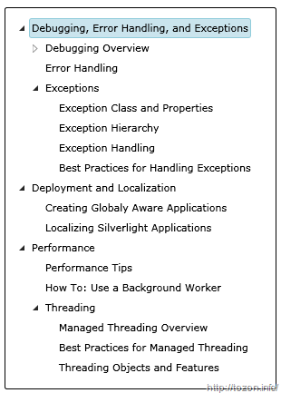
Help Topics TreeViewThis is what our TreeView control looks now. Far from being editable or anything yet, but except coding the dummy data generator and a class with one property, we hardly did any coding; And that’s the power of the MVVM pattern.

Next in the series: modifying the data structure.

The source code for this sample is available:

Integrating Silverlight with Community Server 2008.5

I’m sure Telligent will fully enable Silverlight parts into future Community Server releases, but until then, a couple of tricks are needed to make Silverlight play well with CS. The following points were made with Community Server 2008.5 release.

Include Silverlight apps in posts

The common way to include Silverlight in CS posts is by using HTML iframes. CS is blocking this tag by default so you have to edit communityserver.config file and enable it. Look for the <Markup> tag and go to the <Html> section within it. Add the iframe line somewhere to that section:

<iframe src = "true" frameborder = "true" width = "true" height = "true" />

Only attributes with values set to “true” will be allowed so don’t forget to add the attributes you plan to set on an iframe.

Next, upload the Silverlight app to a web site folder. The files to upload are usually the application’s [app].html (host page), [app].xap (application) and Silverlight.js (JavaScript helper library). Make sure that the uploaded .html file is accessible through the web and the app is working.

The last step is an easy one. Insert the iframe in your post wherever you want to put your Silverlight application. You’ll most commonly do that when editing posts in Html view. I usually put another div tag around an iframe:

<div style="width:100%;height:200px">
  <iframe src="/silverlight/app.html" frameborder="0" width="100%" height="200" />
</div>

Putting Silverlight into CS master page

This one requires some more manual work, but you can use CS’s master page’s system to control where you want to include Silverlight. As I needed to have Silverlight-enabled on all pages, I picked the Master.master file. I also used a different approach for embedding Silverlight – instead of iframe, I used a new Silverlight ASP.NET control, which makes things much easier. You’ll get this control in your toolbox once you install Silverlight SDK. This approach, however, will require you to “upgrade” your web.config to target .NET Framework 3.5. You can either do this manually by copying all the missing sections and other entries into it or by opening the site with Visual Studio 2008 – Visual Studio usually prompts for this kind of upgrade when opening ASP.NET 2.0 projects. You should also add the following reference line into the pages/controls section to make Silverlight possible on every page:

<add assembly="System.Web.Silverlight" namespace="System.Web.UI.SilverlightControls" tagPrefix="asp" />

My edit of Master.master file now looks like this:

... <div id="CommonHeader"> <asp:ScriptManager ID="ScriptManager1" runat="server" /> <asp:Silverlight ID="sl" runat="server" Source="/Silverlight/banner.xap"
Height="100%" Width="100%" Windowless="true" />
<div class="Common"> ...

[inserted lines bold]

Because of the inserted Silverlight control, all existing header contents were pushed further down. To fix this, override affected elements’ CSS style. You’ll do this on the Control Panel | System Administration | Site Administration | Site Theme | Custom Styles (Advanced) page. Just enter the overrides:

#CommonHeaderTitleArea
{
    position: relative;
    top: -113px;
}
#CommonHeaderUserArea
{
    position: relative;
    top: -113px;
}

[Note: my header has its height set to default – 113px, so I had to push it (-)113px up. Change this value according to your header height.

These were just very quick (and dirty) fixes to enable Silverlight in your CS2008.5 site until Silverlight gets native support in Community Site. I’ll most likely be putting even more Silverlight into my CS so I may update this post with even more tips.

Label.Target Pt.2: The return of the (not so) attached property

Following my previous example, this is another experiment with the Label.Target property.

Suppose you want to restrict user’s progression with data input on a form by disabling some crucial input fields, which input depends on some other fields on the form. There’s more than a couple of ways for doing this and the first solution that springs to mind would be doing it by employing business object data validation. But if you need a pure UI/XAML solution, this can be the alternative:

image 
[See it live – loose Xaml page ahead ]

What’s happening in the sample above – the second TextBox gets enabled only when the first TextBox is not empty. The same goes for the third box, except here’s the second box that has to have some text entered into it.

This was done with the help of data triggers:

   1: <Label Target="{Binding ElementName=firstBox}" Content="_1st:" />
   2: <TextBox Name="firstBox" Grid.Column="1" Margin="2" /> 
   3: <Label Target="{Binding ElementName=secondBox}" Content="_2nd:" Grid.Row="1" />
   4: <TextBox Name="secondBox" Grid.Column="1" Margin="2" Grid.Row="1">
   5:   <TextBox.Style>
   6:     <Style TargetType="{x:Type TextBox}">
   7:       <Style.Triggers>
   8:         <DataTrigger Binding="{Binding Path=Text.Length, ElementName=firstBox}" Value="0">
   9:           <Setter Property="IsEnabled" Value="false" />
  10:         </DataTrigger>
  11:       </Style.Triggers>
  12:     </Style>
  13:   </TextBox.Style>
  14: </TextBox>
  15: <Label Target="{Binding ElementName=thirdBox}" Content="3rd:" Grid.Row="2" />
  16: <TextBox Name="thirdBox" Grid.Column="1" Margin="2" Grid.Row="2"> 
  17:   <TextBox.Style>
  18:     <Style TargetType="{x:Type TextBox}">
  19:       <Style.Triggers>
  20:         <DataTrigger Binding="{Binding Path=Text.Length, ElementName=secondBox}" Value="0">
  21:           <Setter Property="IsEnabled" Value="false" />
  22:         </DataTrigger>
  23:       </Style.Triggers>
  24:     </Style>
  25:   </TextBox.Style>
  26: </TextBox>

There’s a lot of repetitive Xaml code above that can be put away by using a style and an attached property.

[Note: I’m going to hijack the Label.Target dependency property here just because it suits the needs for this sample - it’s not even registered as an attached property and this wouldn’t even compile in Visual Studio! In a real application you would want to produce a completely new attached property to avoid all potential troubles that may result from such (mis)use]

As mentioned in the previous post, a Label.Target property can hold a reference to another control on the page. We’re going to use the property to point to the dependency source control:

   1: <Label Target="{Binding ElementName=firstBox}" Content="_1st:" />
   2: <TextBox Name="firstBox" Grid.Column="1" Margin="2" /> 
   3: <Label Target="{Binding ElementName=secondBox}" Content="_2nd:" Grid.Row="1" />
   4: <TextBox Name="secondBox" Grid.Column="1" Margin="2" Grid.Row="1"
   5:   Label.Target="{Binding ElementName=firstBox}" />
   6: <Label Target="{Binding ElementName=thirdBox}" Content="3rd:" Grid.Row="2" />
   7: <TextBox Name="thirdBox" Grid.Column="1" Margin="2" Grid.Row="2" 
   8:   Label.Target="{Binding ElementName=secondBox}" />

The global style is applies the same principle, shown in the previous post:

   1: <Style TargetType="{x:Type TextBox}">
   2:   <Style.Triggers>
   3:     <DataTrigger Binding="{Binding Path=(Label.Target).Text.Length, RelativeSource={RelativeSource Self}}" Value="0">
   4:       <Setter Property="IsEnabled" Value="false" />
   5:     </DataTrigger>
   6:   </Style.Triggers>
   7: </Style>

The data trigger in the above style disables the target TextBox when its Length property is set to 0.

This looks good already, but something is not right… Hint: try the current example live and fill all three boxes, then clear the first one.

We need to fix this and we’ll do it by adding another data trigger, which disables the current TextBox whenever the source TextBox is disabled. Here’s slightly modified version of the style:

   1: <Style TargetType="{x:Type TextBox}">
   2:   <Style.Triggers>
   3:     <DataTrigger Binding="{Binding Path=(Label.Target).Text.Length, RelativeSource={RelativeSource Self}}" Value="0">
   4:       <Setter Property="IsEnabled" Value="false" />
   5:     </DataTrigger>
   6:     <DataTrigger Binding="{Binding Path=(Label.Target).IsEnabled, RelativeSource={RelativeSource Self}}" Value="false">
   7:       <Setter Property="IsEnabled" Value="false" />
   8:     </DataTrigger>
   9:   </Style.Triggers>
  10: </Style>
Well, that’s all, really… A simple example to show the power of WPF data binding through the attached properties. [A post on creating a proper attached property for this sample will follow as I move away from Xaml-only examples]

And this is the final result code for this post [See it in action – loose Xaml file]

Label.TargetProperty as a Source

One of probably most underused features in windows desktop UI development world is got to be the use of a Label as an accessor to its pair control. I rarely see developers using this possibility to enhance keyboard UI navigation.

A couple of things changed about this mechanism when going from Windows Forms to WPF:

  1. The escape character to mark the mnemonic (the letter/key for accessing related control) changed from ‘&’ to ‘_’;
  2. In Windows Forms, the control that received focus was always the one that was next in tab order. With WPF, the pair control is specified with the Label.Target dependency property.

A simple form with this feature enabled would look like:

   1: <Grid>
   2:   ...
   3:   <Label Target="{Binding ElementName=firstNameBox}" Content="_First name:"/>
   4:   <TextBox Name="firstNameBox" Grid.Column="1"/> 
   5:   <Label Target="{Binding ElementName=lastNameBox}" Content="_Last name:" Grid.Row="1" />
   6:   <TextBox Name="lastNameBox" Grid.Column="1" Grid.Row="1"/> 
   7:   ...
   8: </Grid>

The best thing about Label's Target property is not only it sets focus to its pair control, but can also pose as a bridge back to the Label when we need to provide some feedback from the target control. For example, when a TextBox gets disabled,  we would want the associated Label render disabled as well. This is fairly easy to achieve through binding. All we need is a simple style for a label:

   1: <Style TargetType="{x:Type Label}">
   2:   <Setter Property="IsEnabled" Value="{Binding Path=Target.IsEnabled, RelativeSource={RelativeSource Self}}" />
   3: </Style>

The key is in binding's path, which queries target's IsEnabled property and sets it accordingly.

This opens up a range of possibilities. One of my favorite UI tricks is to visually differentiate the focused control from the others by slightly contrasting the label, associated with the focused control.  Label.Target is perfect for this.

I built on my previous example and the result now looks like this:

And here's the Label style I used:

   1: <Style TargetType="Label">
   2:   <Setter Property="Foreground" Value="{StaticResource LabelTextBrush}" />
   3:   <Style.Triggers>
   4:       <DataTrigger Binding="{Binding Path=Target.IsFocused, RelativeSource={RelativeSource Self}}" Value="True" >
   5:           <Setter Property="Control.Foreground" Value="{StaticResource FocusedLabelTextBrush}" />
   6:       </DataTrigger>
   7:   </Style.Triggers>
   8: </Style>

It's similar to the previous one, it just uses a DataTrigger to set Label's foreground color instead of direct property mapping.

I also added a short animation to make TextBoxes flash for a moment when they receive focus.

You can see all this in action by downloading and executing this Loose Xaml page.

Experience new Silverlight skins

Corrina Barber posted a cool looking new skin for Silverlight controls, which indeed looks perfect for giving your application a sketchy appearance when in early stages of development.

However, if you don't find the green color she used sketchy enough, it doesn't get any easier to adjust it to your likings. When we're talking about control skins in WPF/Silverlight, we're talking about styles, right? So...

with a simple Search & Replace in the App.Xaml file she posted along with her sample, I changed some of the colors in her skins to get a bit more of a Black & White / Gray appearance:

Silverlight skin 

Now imagine, how much "damage" you could do to this skin with Expression Blend...

Anyway, this is the fourth Silverlight skin she posted and she's not stopping. If not anything else, this is a great inspiration to start creating your own Silverlight skins!

WPF: When's a Button not a Button

This is a button:

<Button Name="button">Button</Button>

This is a button too:

<ToolBar>
    <Button Name="toolbarButton">Toolbar button</Button>
</ToolBar>

Or is it?

Let's declare a style, targeting a Button type:

<Style TargetType="{x:Type Button}">
    <Setter Property="Background" Value="Green" />
    <Setter Property="Foreground" Value="White" />
</Style>

The result might not be exactly what you expected:

image

Standalone button gets painted according to the declared style, while the button in the ToolBar doesn't. Setting the style explicitly helps:

<ToolBar>
    <Button Name="toolbarButton" 
Style
="{StaticResource ButtonStyle}">Toolbar button</Button
> </ToolBar>

... but that's probably not something we want as we need to apply this style to all the buttons in the given scope.

So what's going on? Well, a ToolBar is a special beast of a control, liking things to be exactly its way, ignoring most of non-direct calls to changing its looks and behavior. It defines and uses some specific resource keys to style its children, and we need to plug into ButtonStyleKey to push our Button style through:

<Style TargetType="{x:Type Button}" x:Key="{x:Static ToolBar.ButtonStyleKey}">
<Setter Property="Background" Value
="Green" />
<Setter Property="Foreground" Value
="White" />
</Style>

Finally, to apply the same style to both common and ToolBar Buttons, we're going to use some of that style inheritance magic:

<Style TargetType="{x:Type Button}" >
    <Setter Property="Background" Value="Green" />
    <Setter Property="Foreground" Value="White" />
</Style>
<Style x:Key="{x:Static ToolBar.ButtonStyleKey}" 
TargetType="{x:Type Button}"
BasedOn="{StaticResource {x:Type Button}}" />
image 
<ToolBar>
    <Button Name="toolbarButton">Toolbar button</Button>
</ToolBar>
<Button Name="button">Button</Button>

Windows Forms controls - controlling the z-order

Talking to other developers and hanging around newsgroups and forums I noticed quite a few people have problems arranging controls on a windows form in design time. A typical problem is the overlapping of docked controls. For example, put a Panel and a MenuStrip on a blank form (in that exact order) and set Panel's Dock property to Fill [MenuStrip should already be docked to top]. This results in Panel's top area being hidden behind the MenuStrip:


Why's that? The way how controls on a form are docked is determined by the z-order [how controls are layered along the form's Z-axis - depth]. The control's z-order is determined by its position in container's Controls collection, with the first control in the collection being at the front (top layer) and the last at the back.

Thus, in the previous example, the form's Controls collection order is: [0: MenuStrip, 1: Panel], and since higher-layered controls can overlap those behind them, the Panel, having Dock set to Fill, can take all the space it needs, without MenuStrip blocking its way.

Now, as you've already guessed, we need to change control's z-order to make things look right. If Panel was put in front of MenuStrip, MenuStrip would still be visible (it's docked to Top) and Panel would only occupy the remaining of form's space.

To fix this at design time, we have a few options:

  • Right-click on the Panel and select "Bring to Front". This will change Panel's position in form's Controls collection to 0, making it the top of z-order. Similarly, you could right-click on MenuStrip and choose "Send to Back".
  • Select the Panel and choose "Format | Order | Bring to Front" from Visual Studio's menu. There are also two icons on the Layout toolbar that do the same thing.

  • Visual Studio 2005 also includes a very useful tool window called Document Outline (menu: View | Other Windows | Document Outline, shortcut: Ctrl+Alt+T), allowing you to rearrange controls by simple drag and drop operations, moving it among different containers and changing their z-order:

At run time, when adding controls dynamically, you can change control's z-order programmatically: every control, derived from Control class, has BringToFront() and SendToBack() methods:

Panel panel = new Panel();
Controls.Add(panel);
panel.BringToFront();

There's many ways you can control the layout of your forms and controls, changing z-order is just one of them. Setting your controls' margins, padding, anchoring and docking properties properly will help you create powerful layouts, which will automatically adjust to various screen resolutions and form's sizes, without the need of additional coding for adapting user controls when user resizes the form.

[Update: images above were copied directly to WLW and published using FTP Image publishing feature. Issues encountered were image blurring - see above - and numerous errors/republish attempts to upload all images successfully. Also, pictures were "taken" on Windows Vista July CTP]