Following my previous example, this is another experiment with the Label.Target property.
Suppose you want to restrict user’s progression with data input on a form by disabling some crucial input fields, which input depends on some other fields on the form. There’s more than a couple of ways for doing this and the first solution that springs to mind would be doing it by employing business object data validation. But if you need a pure UI/XAML solution, this can be the alternative:

[See it live – loose Xaml page ahead ]
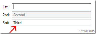
What’s happening in the sample above – the second TextBox gets enabled only when the first TextBox is not empty. The same goes for the third box, except here’s the second box that has to have some text entered into it.
This was done with the help of data triggers:
1: <Label Target="{Binding ElementName=firstBox}" Content="_1st:" />
2: <TextBox Name="firstBox" Grid.Column="1" Margin="2" />
3: <Label Target="{Binding ElementName=secondBox}" Content="_2nd:" Grid.Row="1" />
4: <TextBox Name="secondBox" Grid.Column="1" Margin="2" Grid.Row="1">
5: <TextBox.Style>
6: <Style TargetType="{x:Type TextBox}">
7: <Style.Triggers>
8: <DataTrigger Binding="{Binding Path=Text.Length, ElementName=firstBox}" Value="0">
9: <Setter Property="IsEnabled" Value="false" />
10: </DataTrigger>
11: </Style.Triggers>
12: </Style>
13: </TextBox.Style>
14: </TextBox>
15: <Label Target="{Binding ElementName=thirdBox}" Content="3rd:" Grid.Row="2" />
16: <TextBox Name="thirdBox" Grid.Column="1" Margin="2" Grid.Row="2">
17: <TextBox.Style>
18: <Style TargetType="{x:Type TextBox}">
19: <Style.Triggers>
20: <DataTrigger Binding="{Binding Path=Text.Length, ElementName=secondBox}" Value="0">
21: <Setter Property="IsEnabled" Value="false" />
22: </DataTrigger>
23: </Style.Triggers>
24: </Style>
25: </TextBox.Style>
26: </TextBox>
There’s a lot of repetitive Xaml code above that can be put away by using a style and an attached property.
[Note: I’m going to hijack the Label.Target dependency property here just because it suits the needs for this sample - it’s not even registered as an attached property and this wouldn’t even compile in Visual Studio! In a real application you would want to produce a completely new attached property to avoid all potential troubles that may result from such (mis)use]
As mentioned in the previous post, a Label.Target property can hold a reference to another control on the page. We’re going to use the property to point to the dependency source control:
1: <Label Target="{Binding ElementName=firstBox}" Content="_1st:" />
2: <TextBox Name="firstBox" Grid.Column="1" Margin="2" />
3: <Label Target="{Binding ElementName=secondBox}" Content="_2nd:" Grid.Row="1" />
4: <TextBox Name="secondBox" Grid.Column="1" Margin="2" Grid.Row="1"
5: Label.Target="{Binding ElementName=firstBox}" />
6: <Label Target="{Binding ElementName=thirdBox}" Content="3rd:" Grid.Row="2" />
7: <TextBox Name="thirdBox" Grid.Column="1" Margin="2" Grid.Row="2"
8: Label.Target="{Binding ElementName=secondBox}" />
The global style is applies the same principle, shown in the previous post:
1: <Style TargetType="{x:Type TextBox}">
2: <Style.Triggers>
3: <DataTrigger Binding="{Binding Path=(Label.Target).Text.Length, RelativeSource={RelativeSource Self}}" Value="0">
4: <Setter Property="IsEnabled" Value="false" />
5: </DataTrigger>
6: </Style.Triggers>
7: </Style>
The data trigger in the above style disables the target TextBox when its Length property is set to 0.
This looks good already, but something is not right… Hint: try the current example live and fill all three boxes, then clear the first one.
We need to fix this and we’ll do it by adding another data trigger, which disables the current TextBox whenever the source TextBox is disabled. Here’s slightly modified version of the style:
1: <Style TargetType="{x:Type TextBox}">
2: <Style.Triggers>
3: <DataTrigger Binding="{Binding Path=(Label.Target).Text.Length, RelativeSource={RelativeSource Self}}" Value="0">
4: <Setter Property="IsEnabled" Value="false" />
5: </DataTrigger>
6: <DataTrigger Binding="{Binding Path=(Label.Target).IsEnabled, RelativeSource={RelativeSource Self}}" Value="false">
7: <Setter Property="IsEnabled" Value="false" />
8: </DataTrigger>
9: </Style.Triggers>
10: </Style>
Well, that’s all, really… A simple example to show the power of WPF data binding through the attached properties.
[A post on creating a proper attached property for this sample will follow as I move away from Xaml-only examples]
And this is the final result code for this post [See it in action – loose Xaml file]
550223b3-705c-4da5-884d-edff98137a8c|0|.0|27604f05-86ad-47ef-9e05-950bb762570c